Project team
Creating the UK's first community-driven property marketplace
When Abodda approached us, they were preparing to enter one of the most emotionally charged categories in the UK, property, with the conviction that the existing playbook wasn't enough. Buyers and renters weren't just choosing a flat or a house. They were choosing a neighbourhood, a high street, a community, a place to belong. Abodda's ambition was to build the first marketplace that took all of that seriously, bringing homes, neighbourhoods, local hotspots and communities together in one place.
That ambition signalled something more. Abodda didn't just need a product or a visual identity. It needed a brand with the warmth to speak to home movers at the most personal moment of their year, and the confidence to bring estate agents, developers and investors with it. Our work shaped the strategic foundation, the identity, and the language system that would carry Abodda from launch into the UK's first community-driven property superbrand. Since then, Abodda has connected with thousands of estate agencies across the UK, earned backing from industry leaders, and is guided by advisors including Mark Logan, former COO of Skyscanner.
Region:
United Kingdom
Capabilities:
Creative Direction, UI/UX, Brand, Web Development, AI Tooling, Motion, Strategy
BRAND STRATEGY
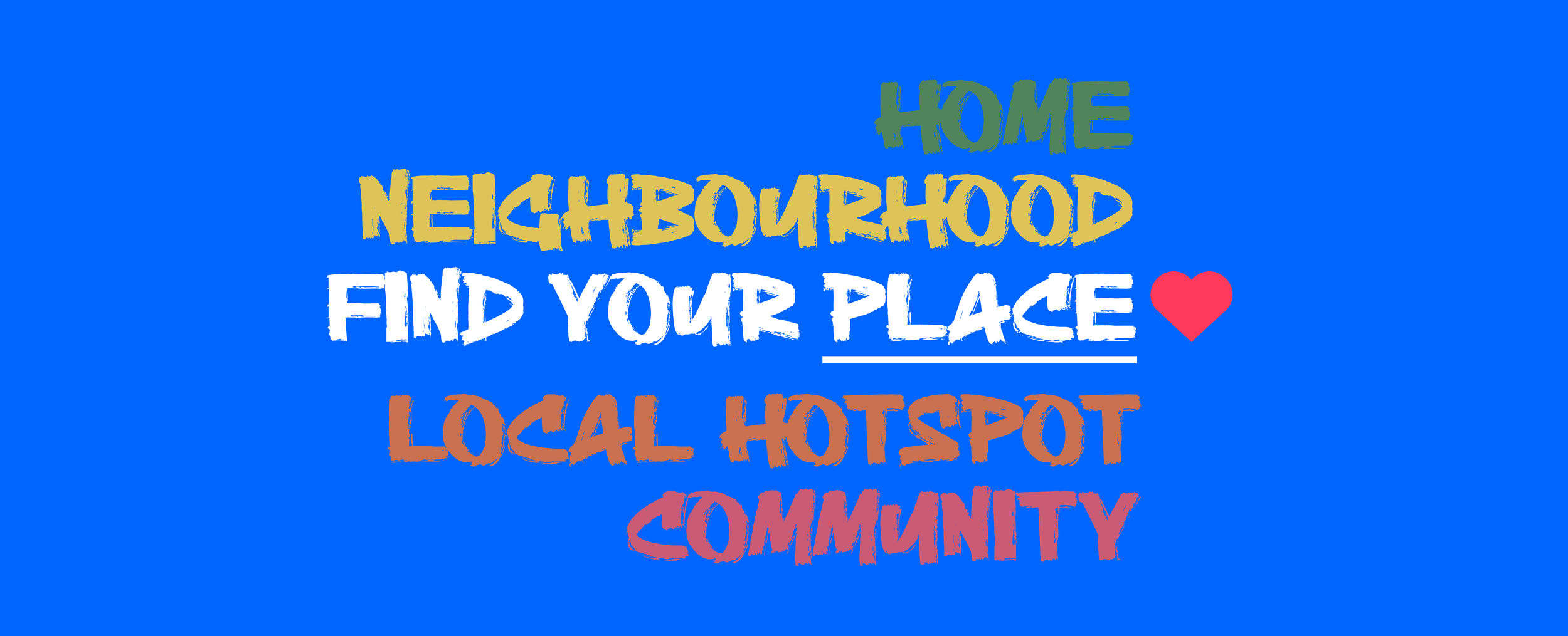
Abodda was born from a simple truth: people don't just move into a property, they move into a life. A high street, a park, a school run, a favourite café. The existing property platforms were treating homes as listings. We saw an opportunity to treat them as the starting point of something bigger.
Our strategy positioned Abodda as the UK's first community-driven property marketplace. Not just where you live, but how you live. By connecting homes with neighbourhoods, local hotspots, and the people around them, we gave home movers something no other platform offered: the full picture.
BRAND IDENTITY
The identity needed to feel as warm and welcoming as the moment you walk through your front door for the first time. We built a visual system rooted in openness, with a wordmark that feels approachable and modern, a colour palette drawn from the textures of neighbourhood life, and an illustration language that brings community to the surface.
Every element was designed to carry meaning. Greens for the streets and parks, warm tones for the homes and gathering spaces, and Abodda blue as the thread that ties it all together. An identity flexible enough to stretch across every touchpoint, and human enough to feel like it belongs in the communities it serves.
BRAND EXPRESSION
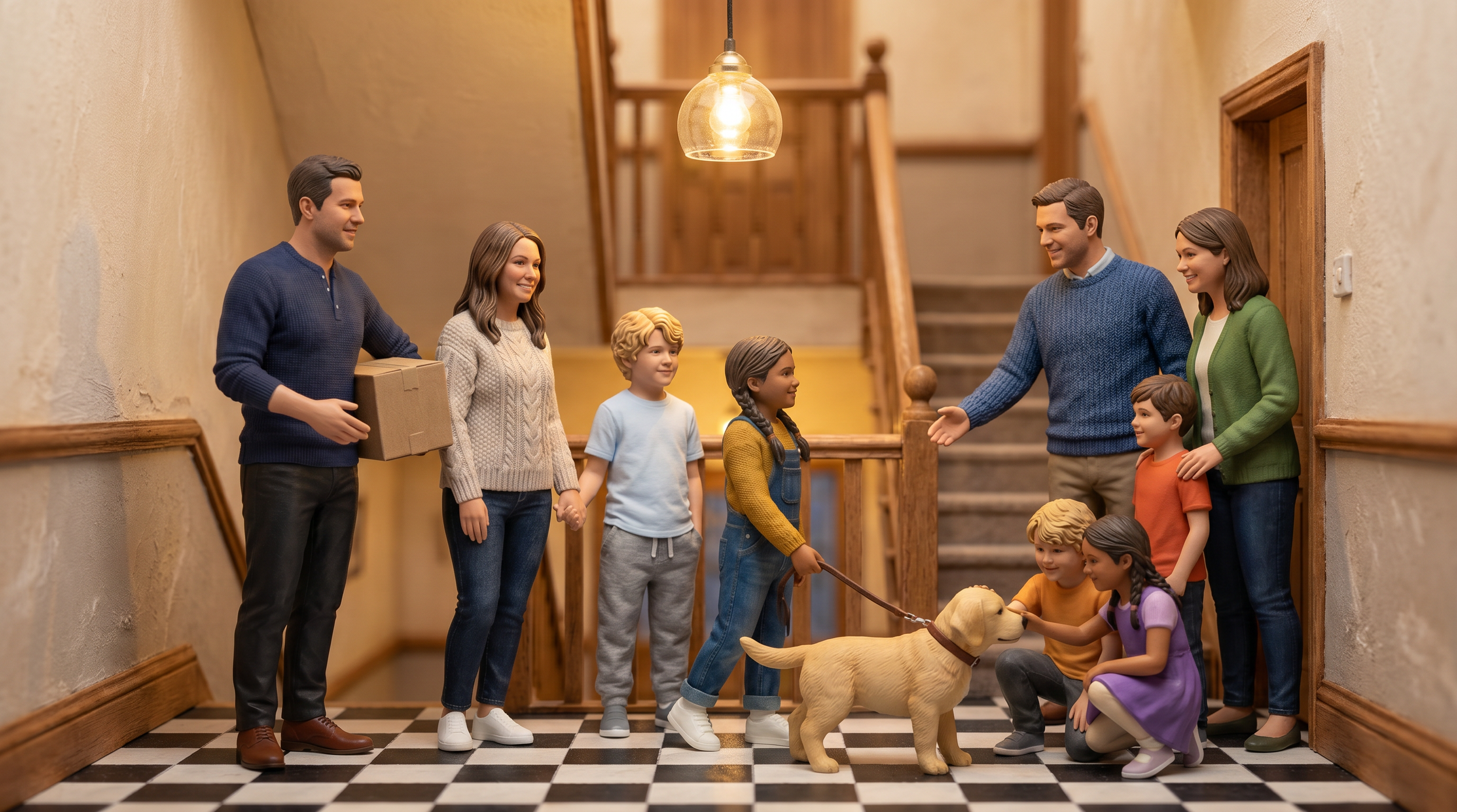
We brought Abodda into the real world through outdoor advertising and campaign storytelling. Billboard ads put the brand in front of home movers across the UK, while the Parkers, a family leaving their small town for London, brought the brand to life through a narrative that captures what it really feels like to find your place.


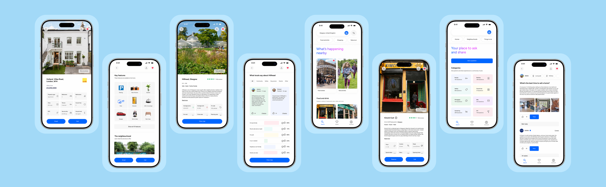
PRODUCT DESIGN
With the strategy and identity in place, we brought Abodda to life through its product and storytelling. The product was designed to feel intuitive and personal, giving home movers everything they need in one place, from property listings and neighbourhood insights to local reviews and community features. To show what that experience really means, we created the Parkers, a family leaving their small town for London, whose journey captures the moment a new house starts to feel like home.