Project team
Building the brand behind every brave little patient’s reward
When Småkryp approached us, they were already well established in one of the most meaningful corners of children's retail. Reward toys. The small gifts handed to kids after a dental visit, a hospital stay, a vaccination. Småkryp had been supplying these to hospitals, clinics and dentists across Sweden for years, but the brand hadn't kept up. With a turnover of 30 million SEK and consistent year on year growth, they were no longer a small operation. They were working with governments, public healthcare systems and major institutions across seven countries. Germany, the UK, Norway, Finland, the Netherlands, Denmark and Sweden. The ambition was real, but the brand still looked like a local supplier.
That gap needed closing. Småkryp didn't just need a new look or a tidied up catalogue. It needed a brand that could sit comfortably in a government tender document and still feel like it belonged in a child's world. Our work shaped the logo, the colour identity, the animation system and the strategy that ties it all together. We built the website and the e-commerce platform to support their expansion into new markets. Everything was designed to carry one idea forward: that Småkryp is the partner that turns a difficult moment into a good memory.
Region:
Sweden, Denmark, Finland, Norway, Germany, Netherlands, United Kingdom
Capabilities:
Motion, Strategy, UI/UX, Brand, Web Development, Strategy
BRAND STRATEGY
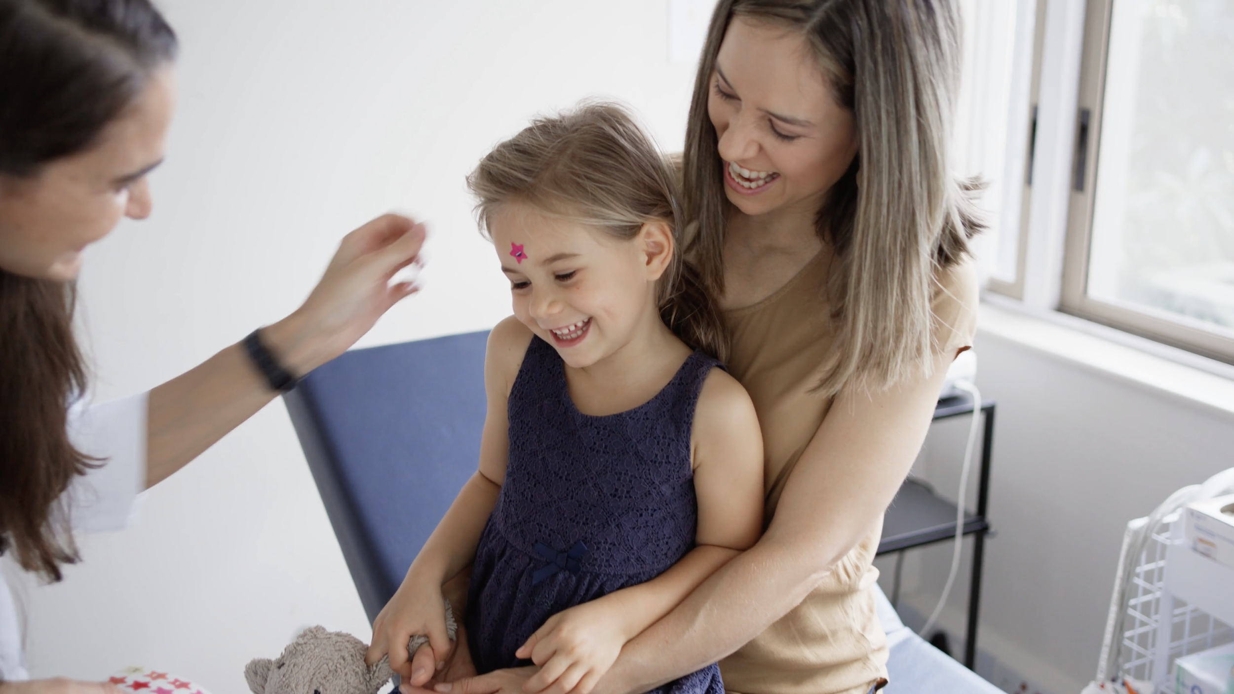
A child walks out of a dental clinic clutching a small toy. That moment, the last one they remember, shapes how they feel about the next visit. Most suppliers in this space were treating their products as stock. We saw an opportunity to treat them as something worth building a brand around.
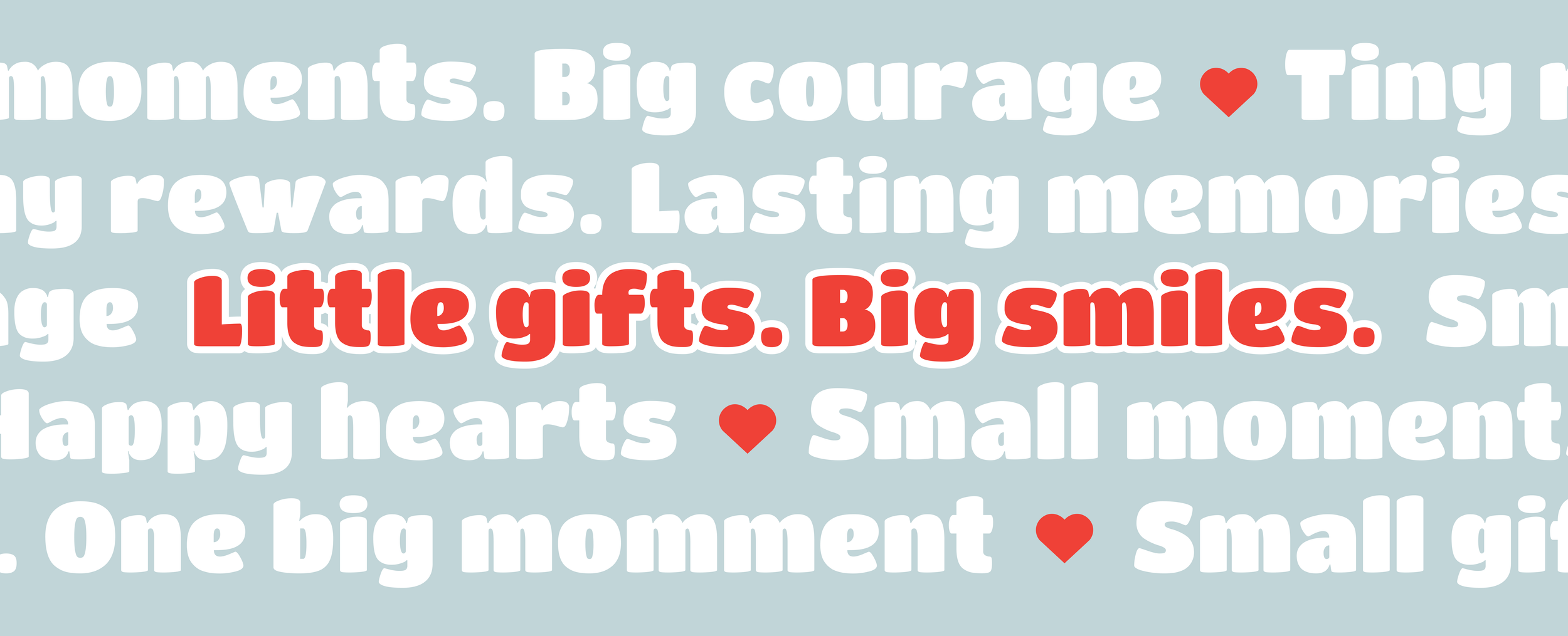
Our strategy positioned Småkryp as the trusted partner behind that moment. We created the line "Little gifts. Big smiles." to anchor the brand across every touchpoint and built the positioning framework to support their expansion into seven countries.
BRAND IDENTITY
A brand for children needs to feel alive. Småkryp had grown into something significant, operating across seven countries, working with governments and public healthcare systems, and the brand needed to reflect that ambition.
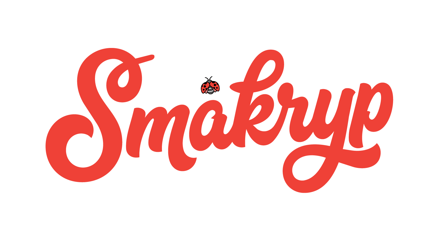
The new logo is warm, playful and full of character. The custom wordmark carries a handcrafted quality that feels intentional, like something made with care, not churned out. The ladybird sits within it naturally, a small detail that rewards a second look and ties back to the name itself.
But playful alone wasn't enough. The mark needed to hold its own in serious contexts too. A tender document. A hospital procurement sheet. A government contract. The balance was everything, friendly without being naive, expressive without being chaotic.
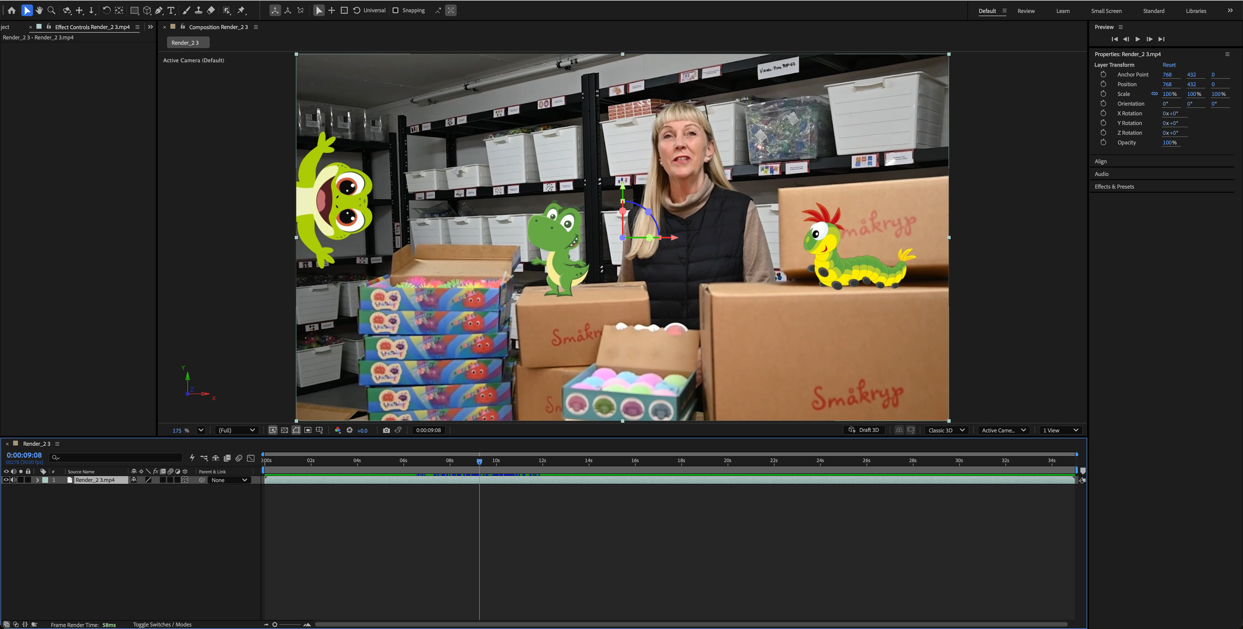
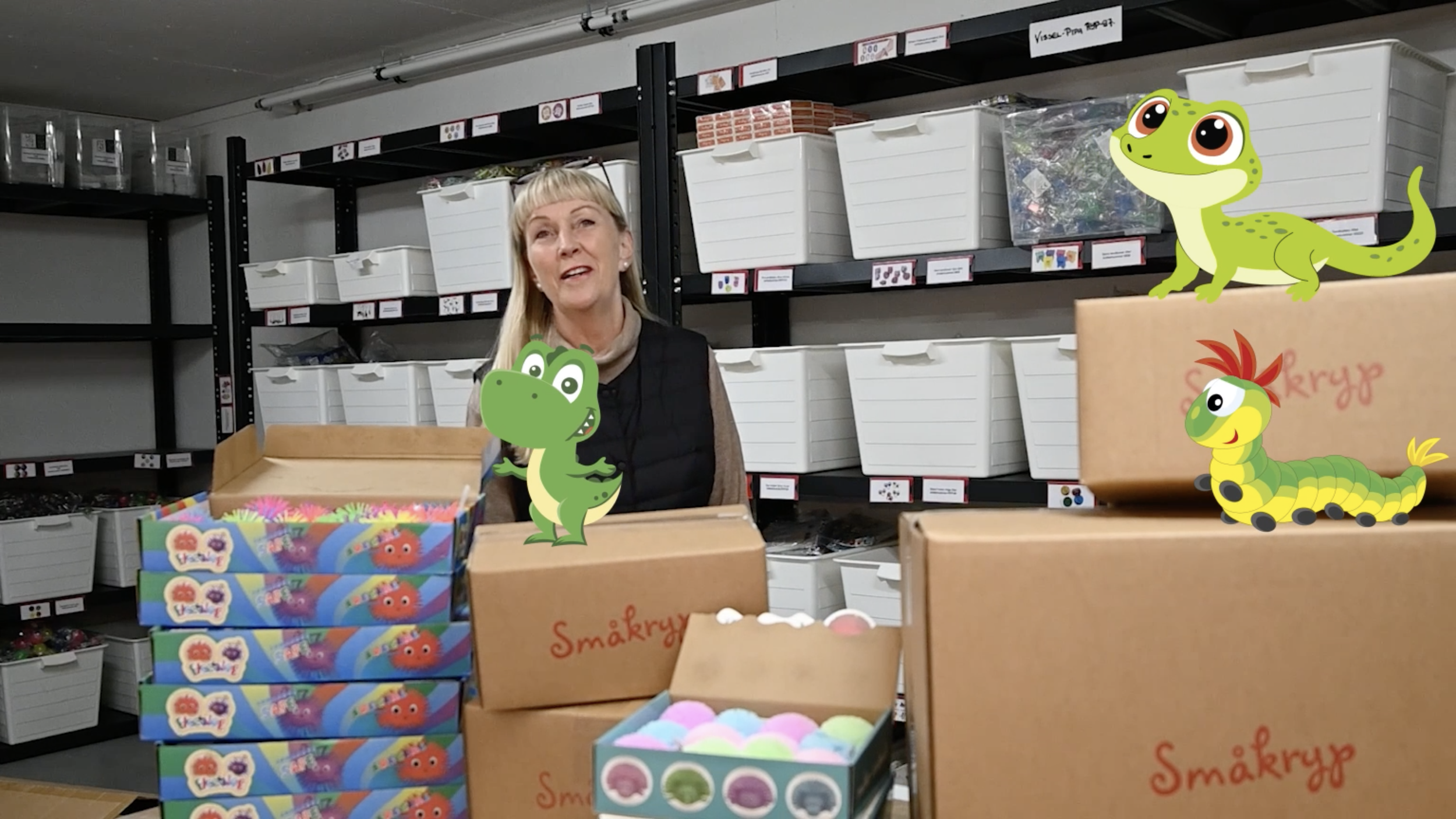
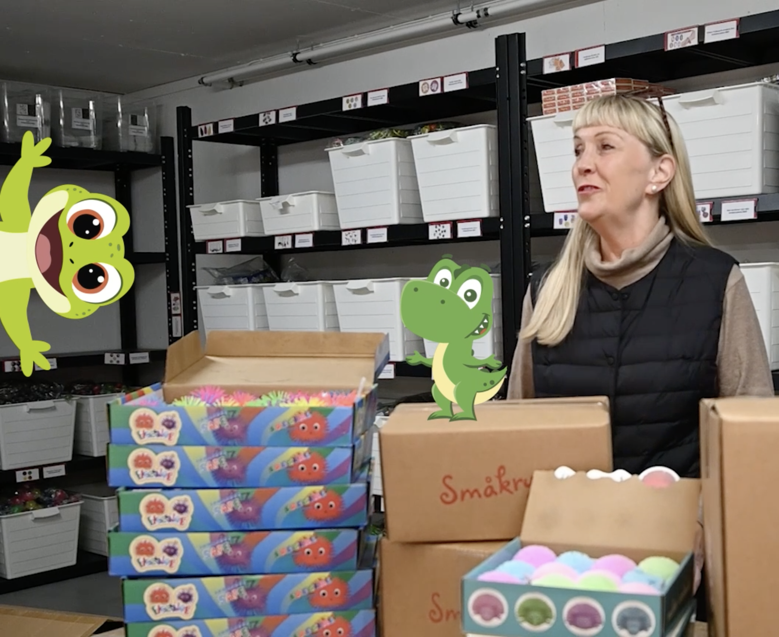
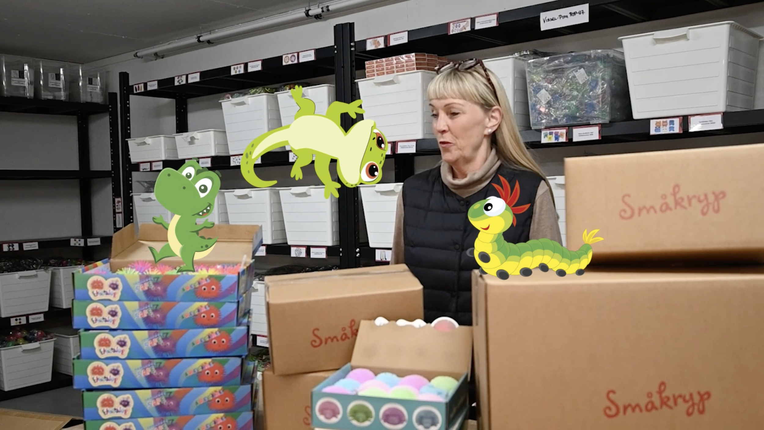
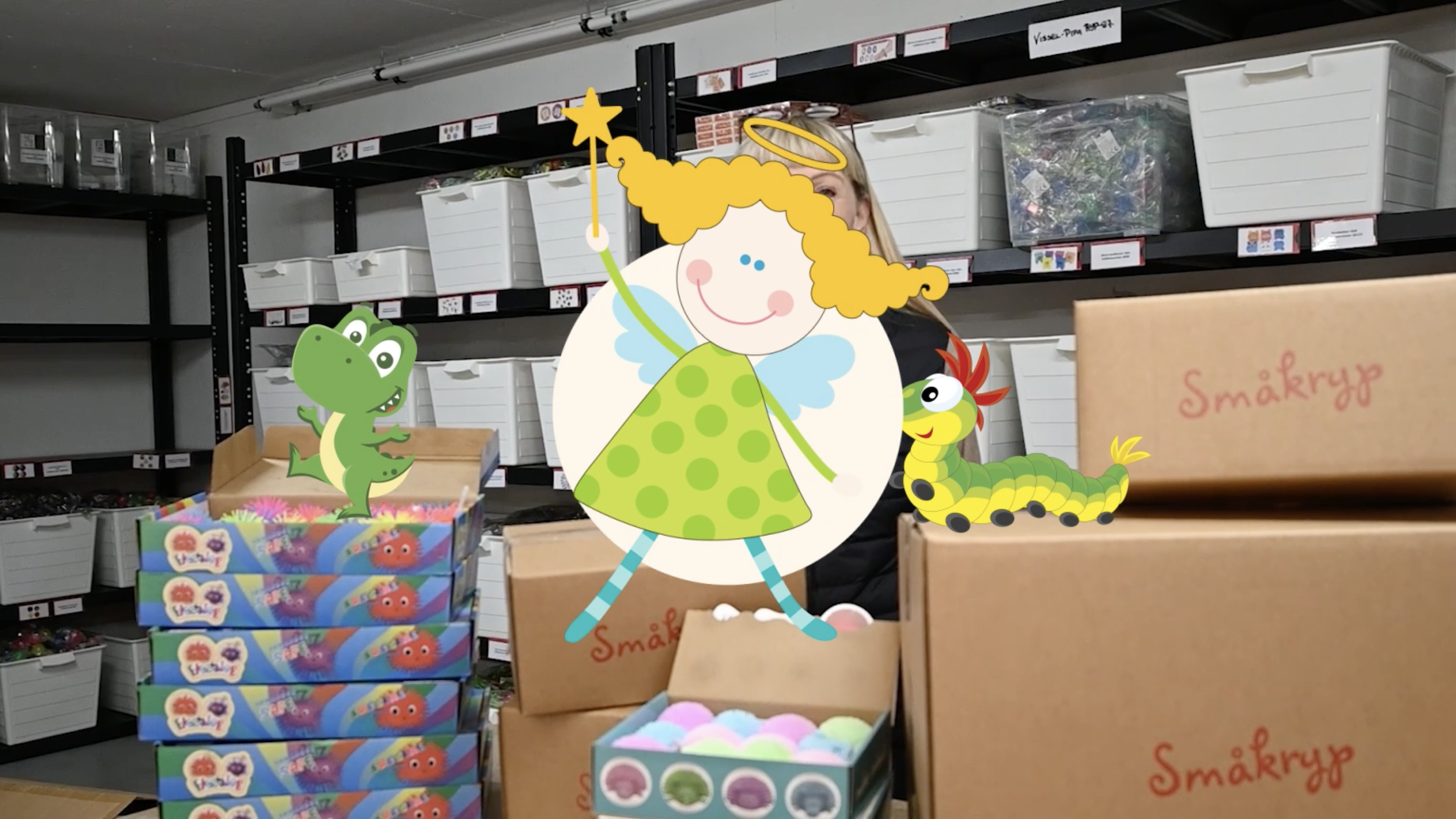
Every brand needs a moment where it comes to life. For Småkryp, that was a welcome video that put the products, and the personality behind them, front and centre. We combined live footage with animated characters, letting the creatures that fill Småkryp's catalogue spill into the real world. Playful, warm and a little bit chaotic in the best possible way. The kind of introduction that tells you everything you need to know about a brand in under a minute.
BRAND EXPRESSION
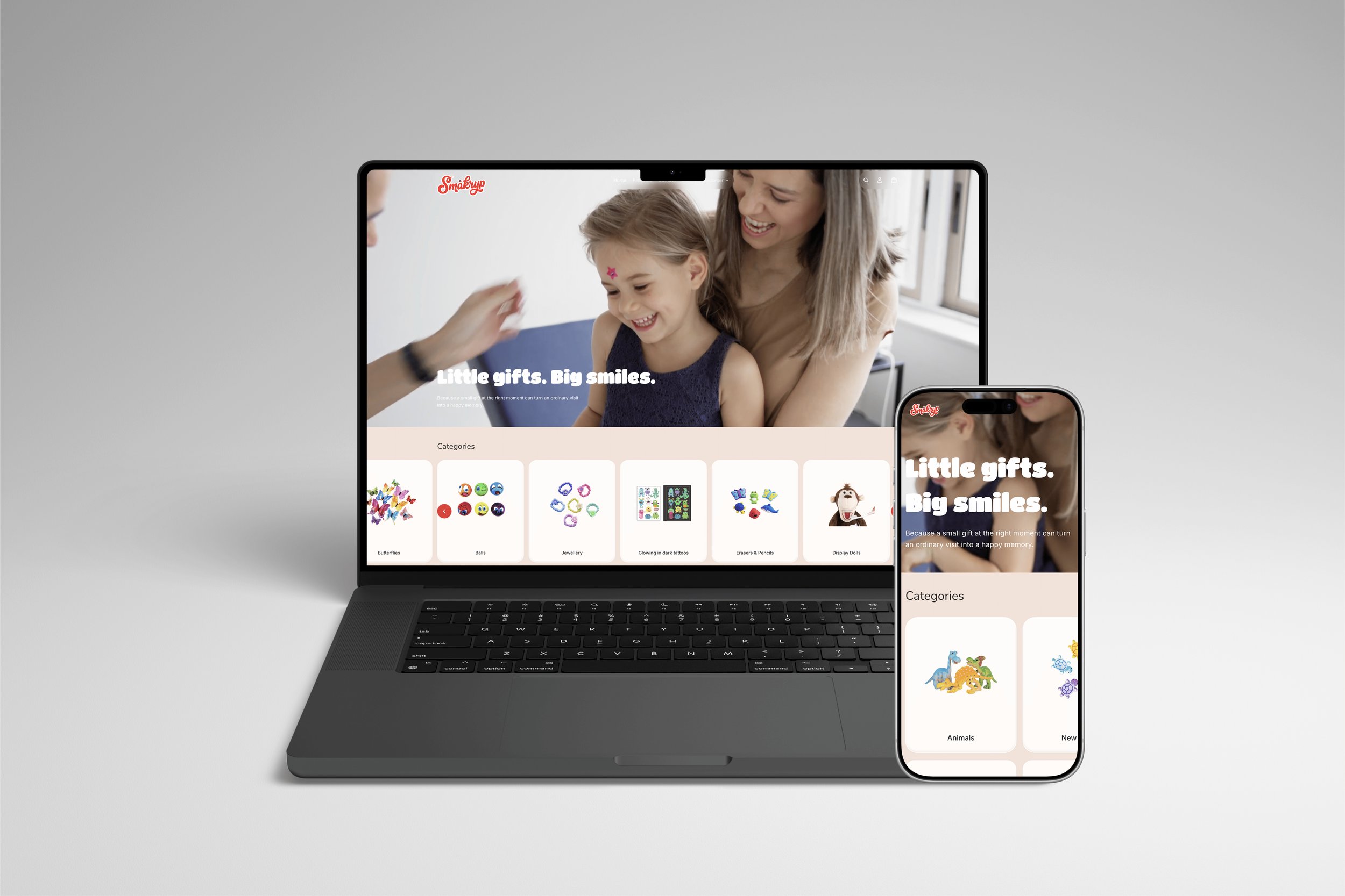
The website needed to do two things at once, work as a considered B2B catalogue for healthcare procurement, and feel warm and inviting enough for the brand to shine. We built the e-commerce platform on Shopify, using custom Liquid, CSS and plugins to push well beyond what the theme could do out of the box. Every detail of the design was rooted in the identity, the colours, the typography, the soft rounded forms, so the site feels like a natural extension of the brand rather than an afterthought. Fully optimised across desktop, tablet and mobile, clean and easy to navigate, and built to scale as Småkryp continues to grow across new markets.
PRODUCT DESIGN