
Project team
Building a brand for a house that cooks with the seasons
Kockska Huset is one of the oldest buildings in Malmö. Its walls go back to the 1500s. Inside it, Årstiderna has been feeding the city since 1967 — a restaurant that earns its reputation one season at a time, shaped by what's good right now and nothing else.
When the house began to grow — new rooms, a grill concept, event spaces, a bigger story to tell — it needed a brand that could hold it all together. We built it from the beginning. A monogram drawn from the architecture of the building itself, a wordmark, an oxblood colour identity, brand guidelines, and a voice that could carry the weight of five centuries without feeling heavy.
From there, the system went to work. Signage, menus, packaging, printed details. Photography that shows the food and the space the way they actually feel. A new website that brings the full house together — Årstiderna, Järn, Gillesalarna, catering, events — in one place, with the same quiet confidence running through all of it.
The result is a brand that grows with the building. New rooms, new concepts, new reasons to come through the door — and one identity that makes them all read as part of the same story.
Region:
Sweden
Capabilities:
Brand identity, Naming, Brand guidelines, Creative direction, Photography, Website design
BRAND IDENTITY
Kockska Huset had the history. What it needed was a way to carry it. We built the identity from the building outward — starting with the KH monogram, a letterform drawn from the angular timber beams that have held the house together since the 1500s. The structure of the architecture became the structure of the mark.
From there, the system took shape. An oxblood palette that feels as old as the walls and as considered as the food. Wordmarks for Årstiderna and Järn that sit in the same visual family without being identical. Brand guidelines tight enough to keep everything coherent across a house with multiple concepts, multiple rooms, and a lot of moving parts.
The result is an identity that doesn't announce itself. It just fits — the way the building fits the square it's stood on for five hundred years.
BRAND EXPRESSION
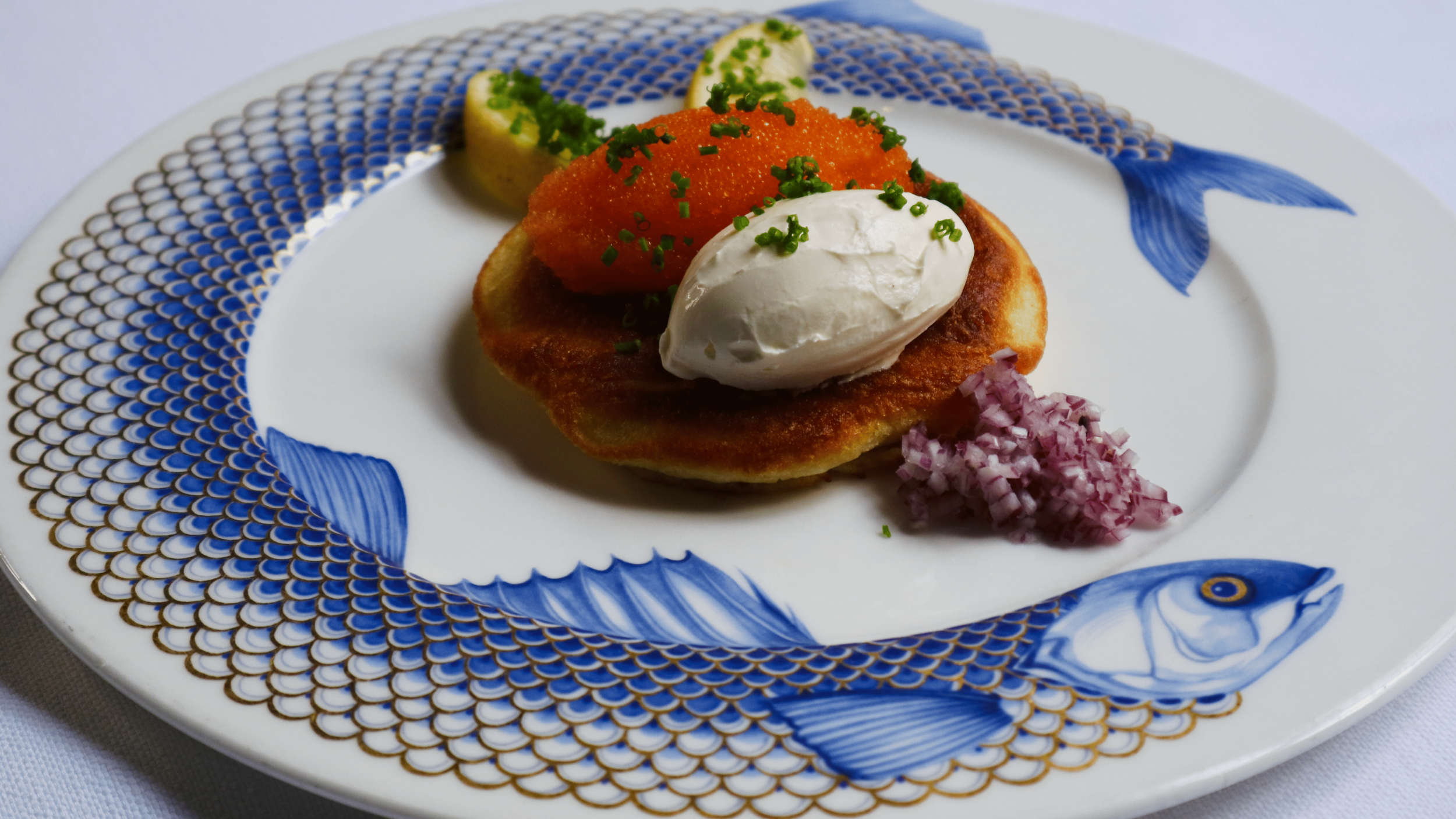
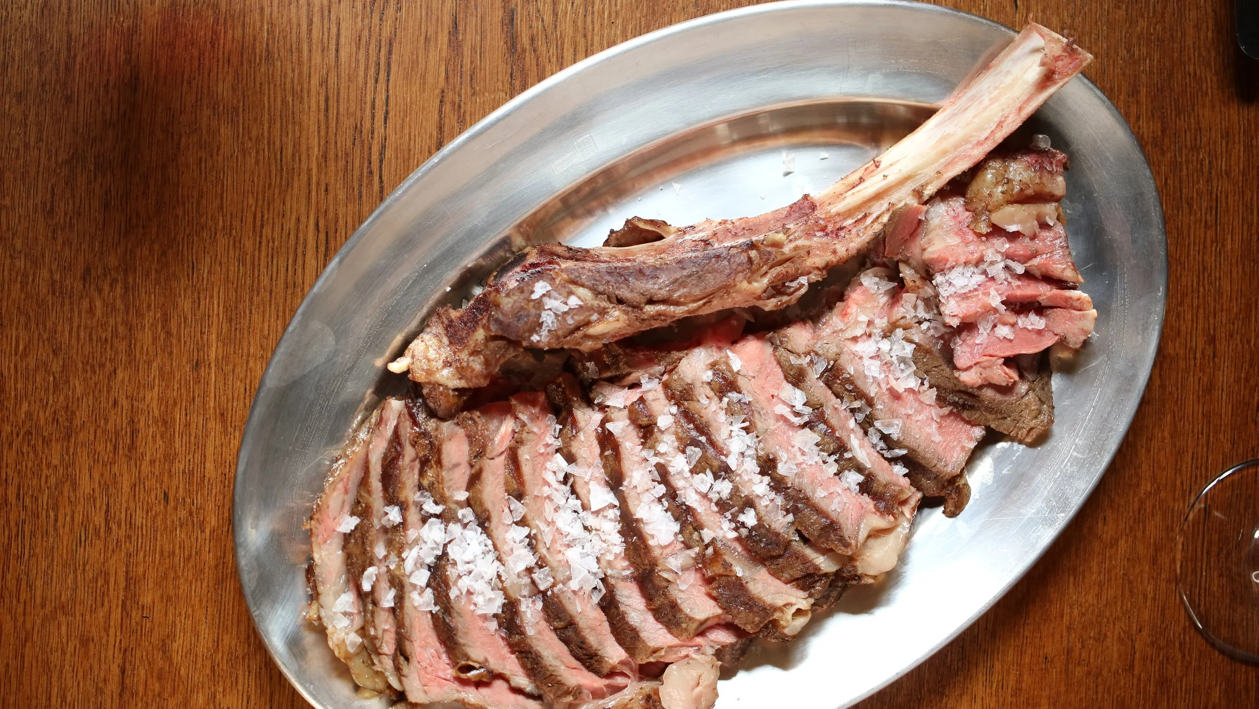
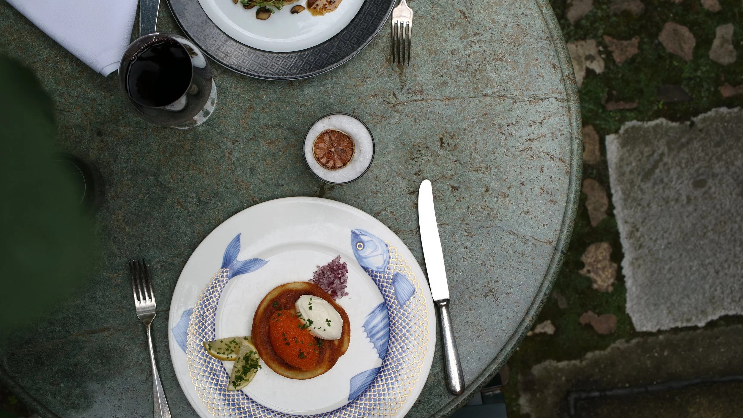
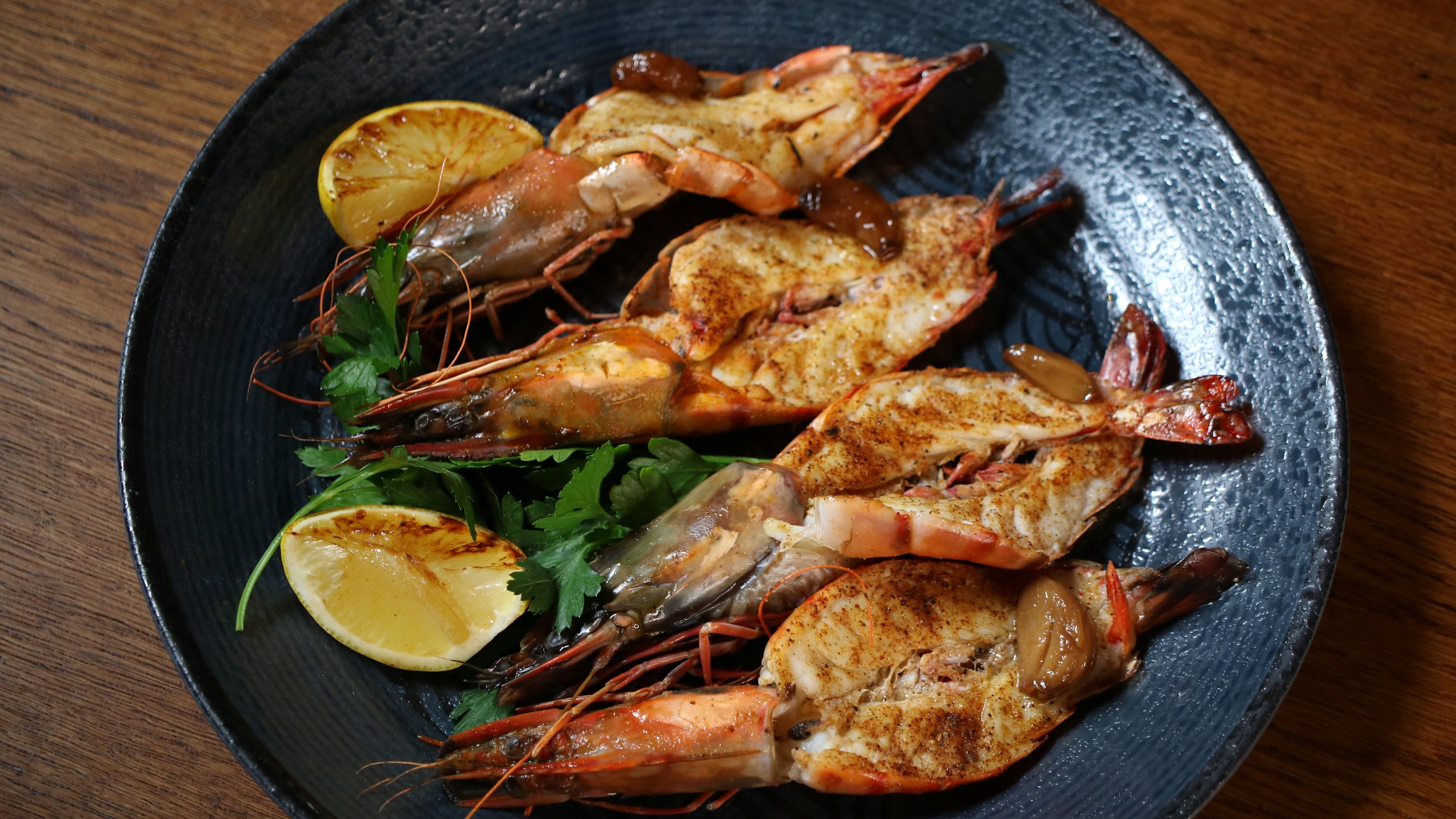
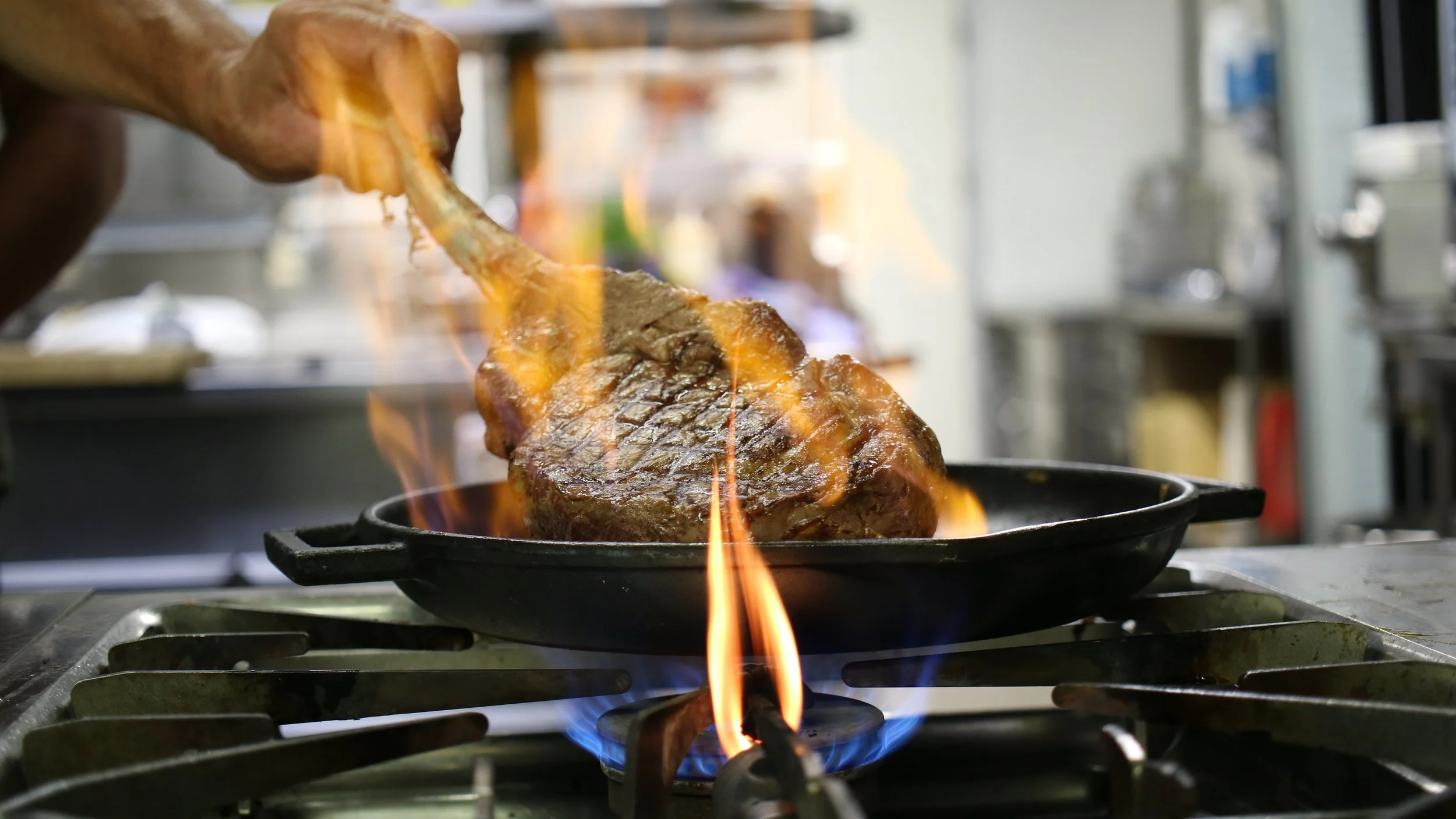
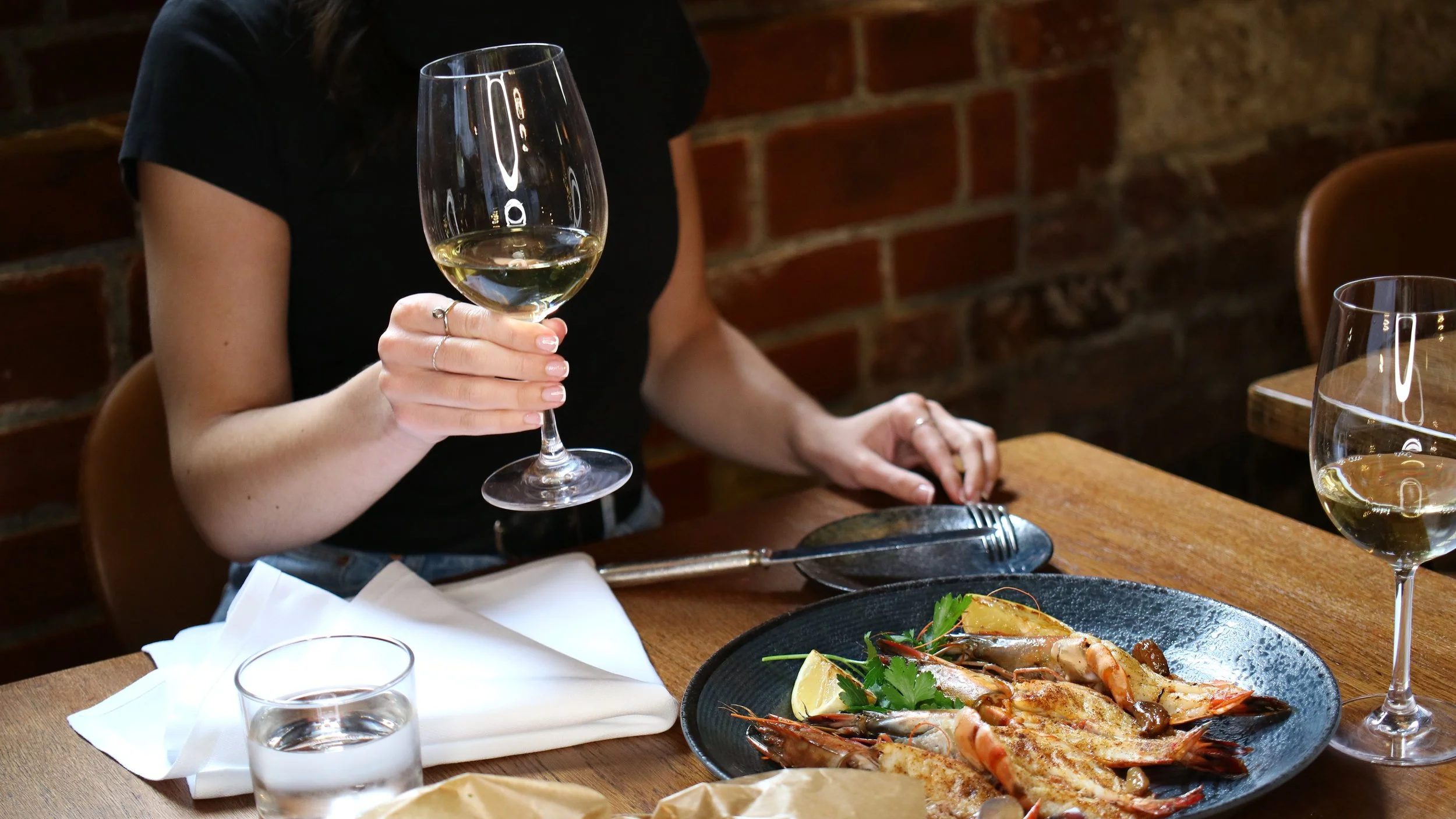
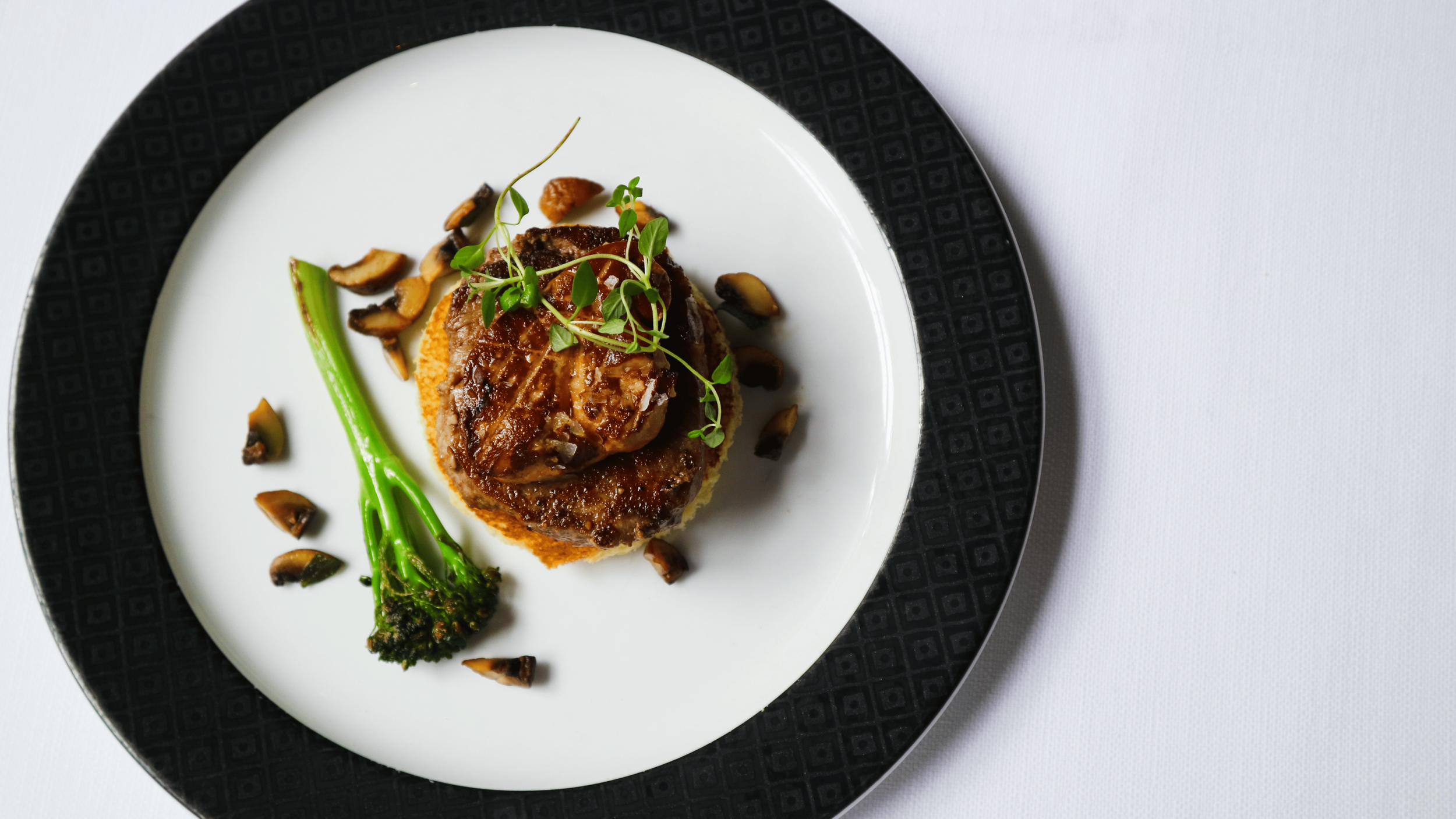
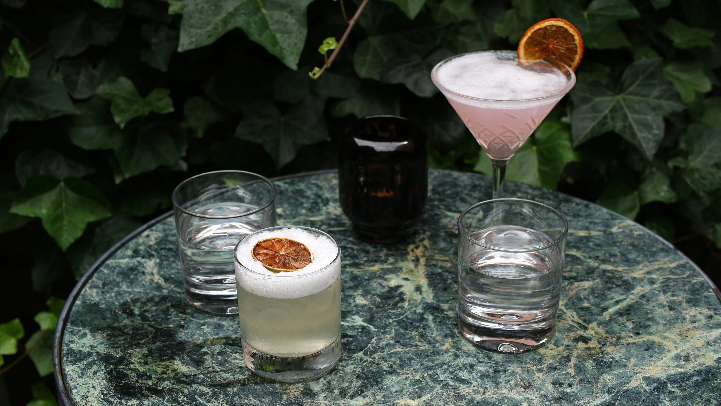
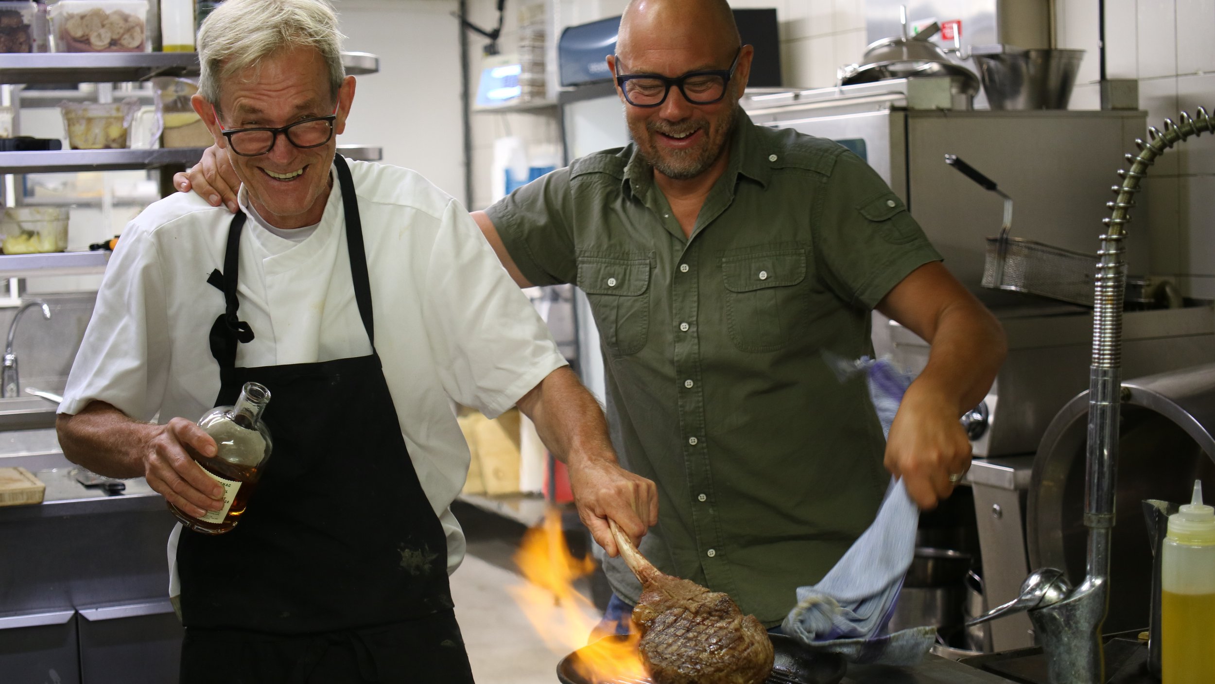
Food photography is direction as much as it is light and timing. You decide what the restaurant says about itself before a single guest walks in. For Kockska Huset that meant showing the food the way it actually is — precise, seasonal, cooked with confidence — without making it look like it's trying.
We shot across the house. The kitchen at full heat. Dishes plated and ready. The table mid-meal, a glass lifted, the kind of moment that doesn't wait. Nothing was staged to look perfect. Everything was shot to feel true.
The images work across the website, menus, social, and print — a consistent visual language that carries the same weight as the brand itself.
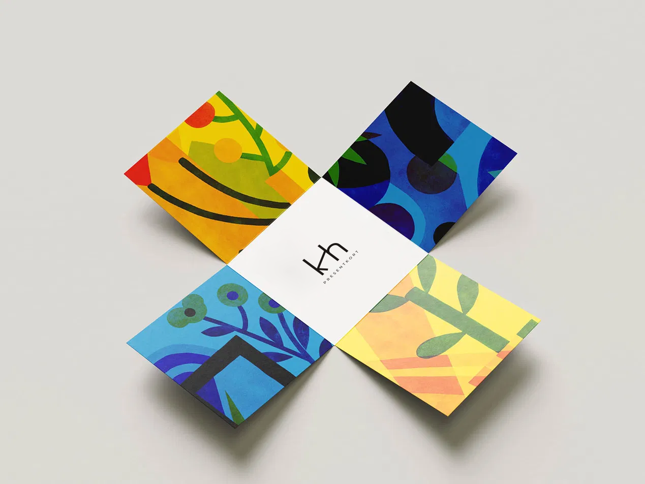
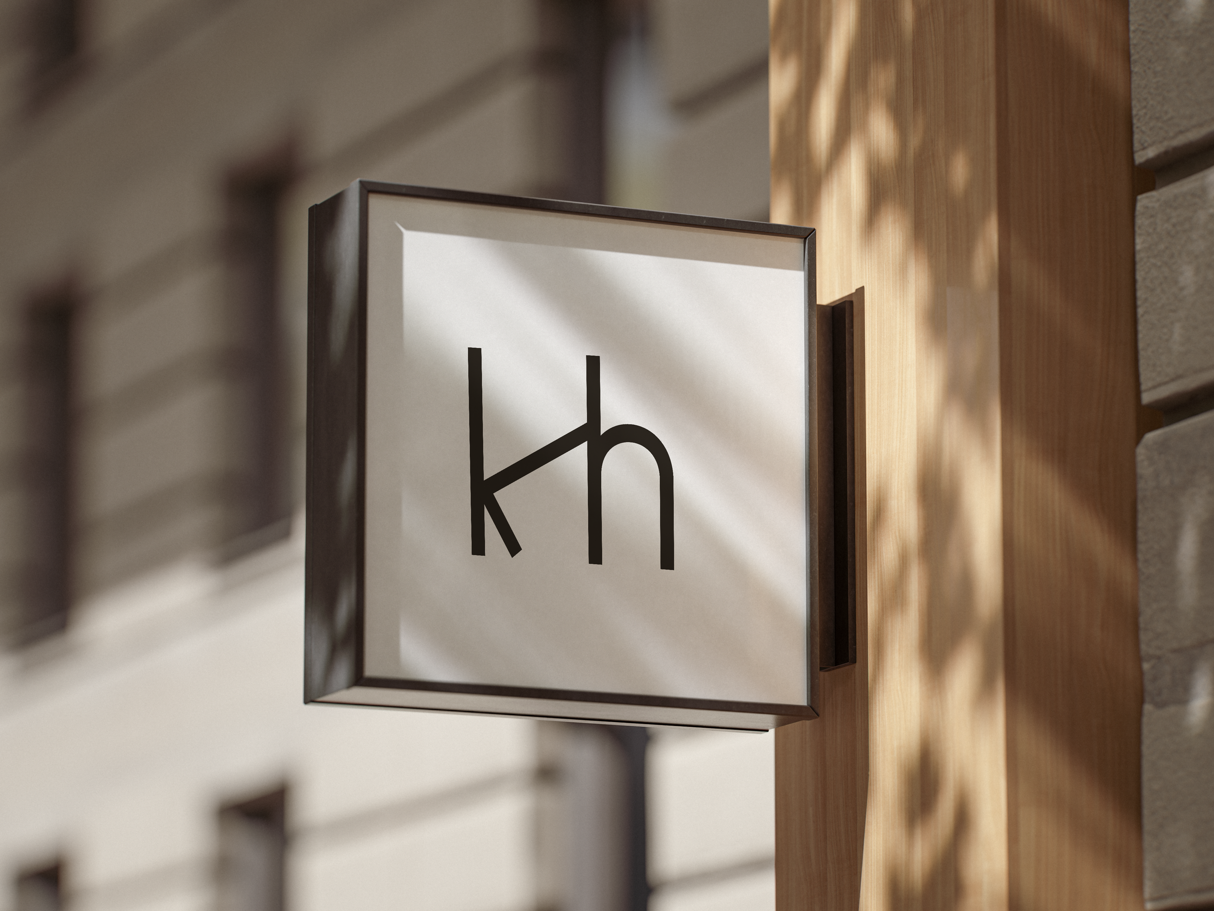
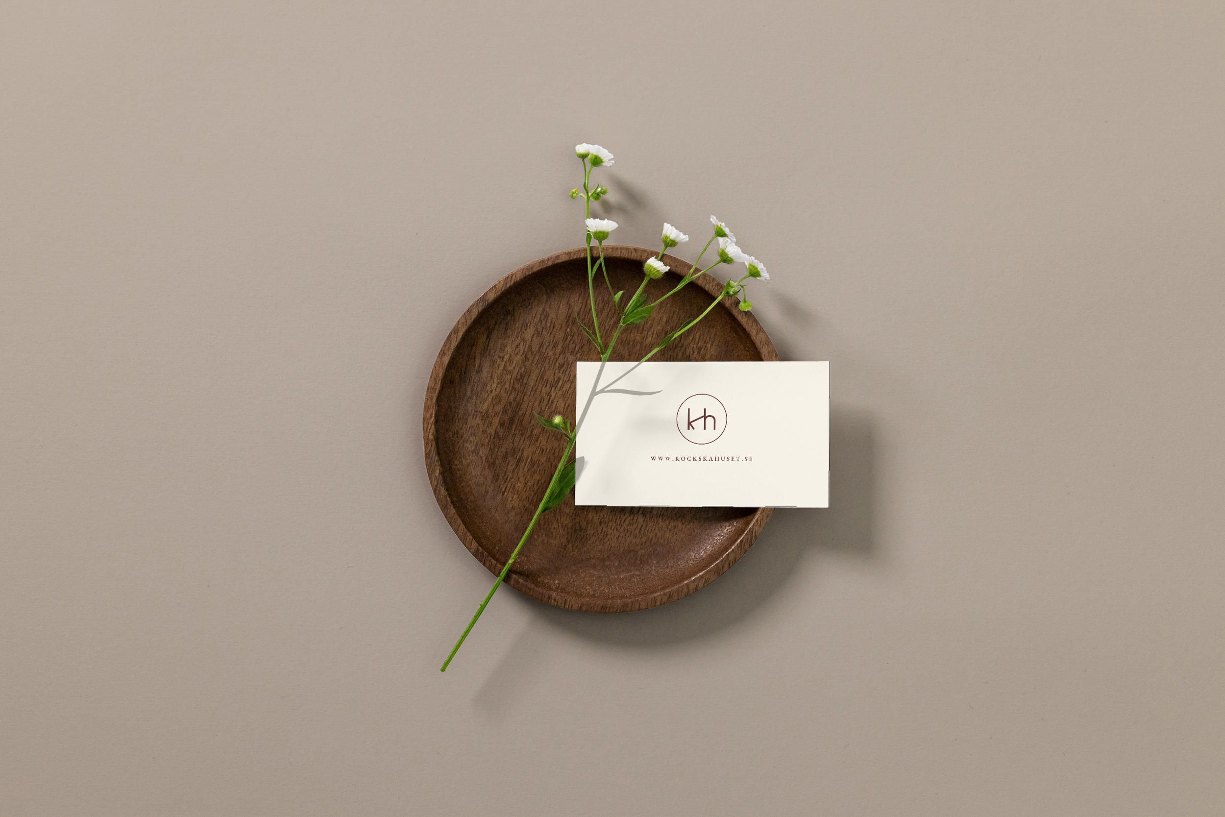
A brand only earns its keep when it leaves the guidelines and goes to work. For Kockska Huset that meant taking the identity across every surface a guest actually touches — business cards, menus, signage, packaging, gift cards, printed collateral.
The KH monogram and the oxblood palette carry through all of it. Nothing was treated as a small detail. A business card sitting in a wooden dish is still a brand decision. So is the way a menu opens, the weight of the paper, the way the mark sits on a gift card envelope.
The system is built to scale. As the house grows — new rooms, new concepts, new reasons to come through the door — the identity is ready for it.
BRAND ACTIVATION
PRODUCT DESIGN
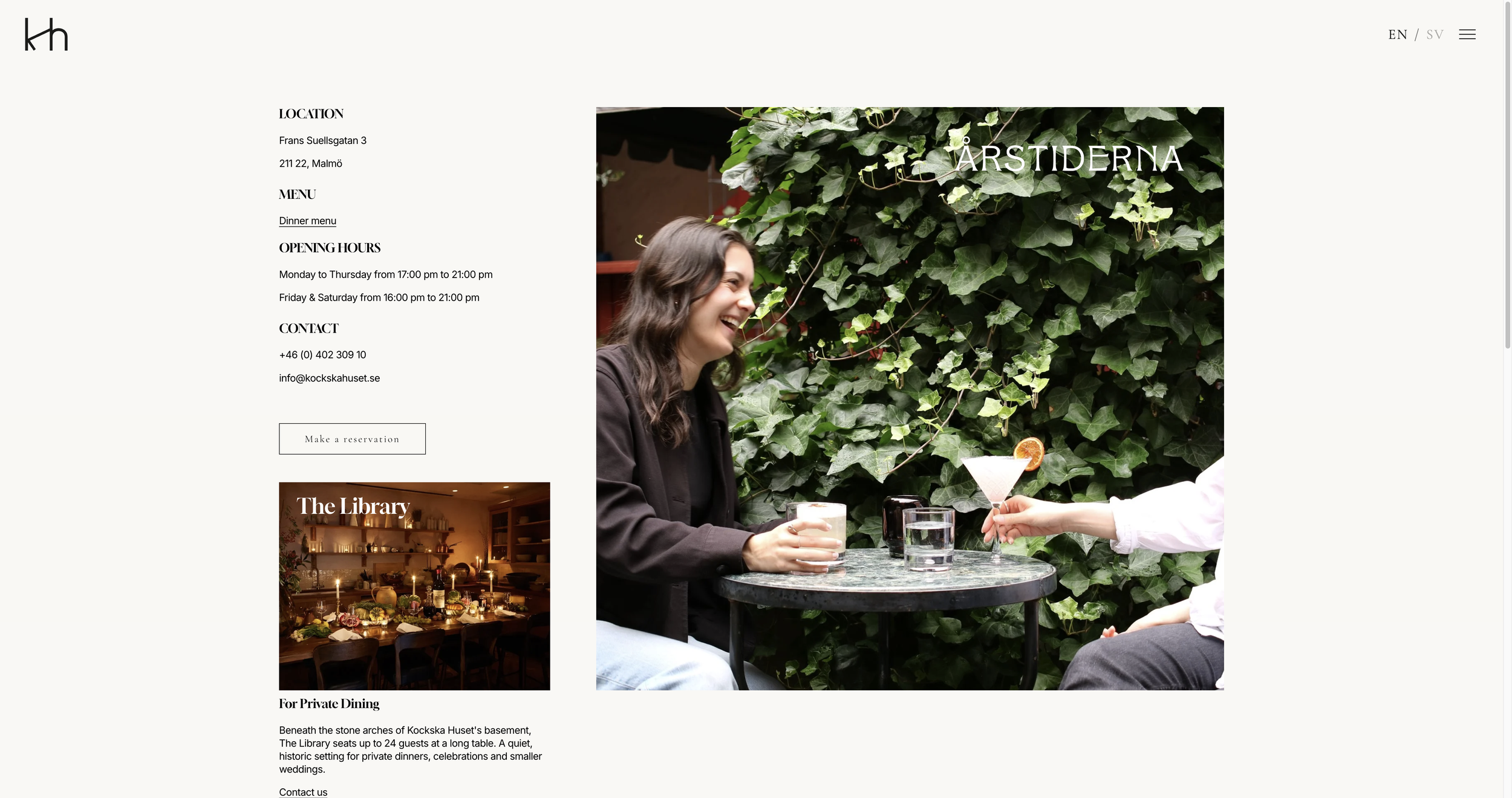
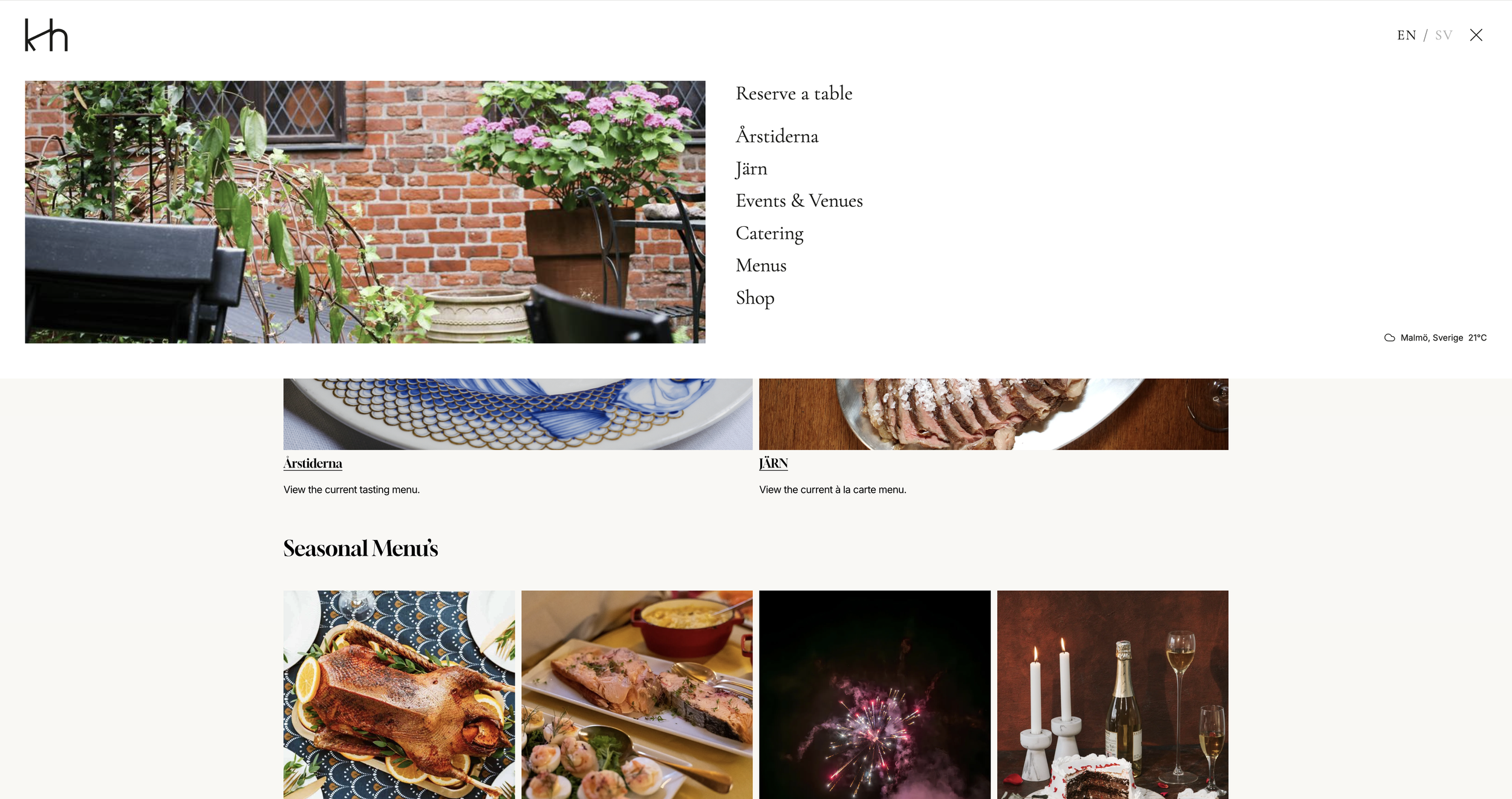
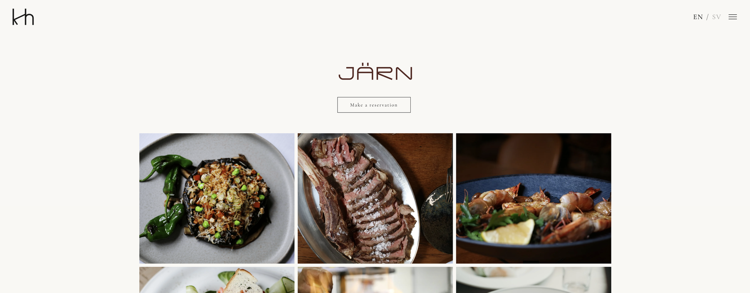
The house had grown. Årstiderna, Järn, Gillesalarna, The Library, catering, events, a shop — five concepts under one roof, each with its own identity, all needing to feel like part of the same place. The website had to hold that without making it complicated.
We built it around the food and the building — minimal, editorial, with the kind of restraint that lets the photography do the work. Clean type, generous space, nothing competing with what's on the plate or what's behind the door. Every page has a job: tell people what the space is, make them want to be there, make booking easy. The Caspeco booking integration sits directly inside the site, no redirects, no friction.
The result is a website that works the way the house does — multiple rooms, one address, everything exactly where it should be.